Details
Clients
Location
Involvement

Visioneer Studio was given the task of leading brand development

behind a breakthrough product that could effectively measure the potency of LSD, MDMA, and Psilocybin. Until this point, the only tests to ever hit the market were ones that could measure the purity of a substance, but never the potency. After going through hundreds of names and ideas, we finally decided to call the test kit box “Felix,” named after the scientist and founder of the offering. This decision enabled us to connect the user to the founder on a deeper more human level. It also enabled us to develop a variety of clever marketing materials and systems for engaging the customer on the website.

While other test kits on the market utilized branding geared towards a drug consuming aesthetic and stereotype

We wanted to associate ourselves with safety and scientific accuracy. Our choice of identity lends itself to mathematics and precision. Both the font and the brand mark utilize clean geometry, and the brand mark itself is a play on the elements found in the periodic table.

Above are three separate instructional pamphlets that went into each individual test kit. As you can see, we kept the color themes coordinated for each kit so that they would each have their own unique identity within our branding ecosystem. Inside these pamphlets we created a series of icons to accompany the explanations for how to use the test kit. 
 
The beautiful photos displayed on the left side of the cover of these pamphlets were taken through a microscope at 400X magnification.
Each photo pertains to the specific molecule being tested. We custom ordered these images specifically for our branding purposes. 
 
We were aware that we had the power to increase the appreciation for the substance itself, and in doing so could make a positive contribution to the mindset of the user taking the sacrament. While we do love the aesthetic, we were also aware that improving the mindset of the user of one of these substances is scientifically proven to increase the likelihood of a positive experience. This was our own subconscious attempt at improving safety and empowering its users.   
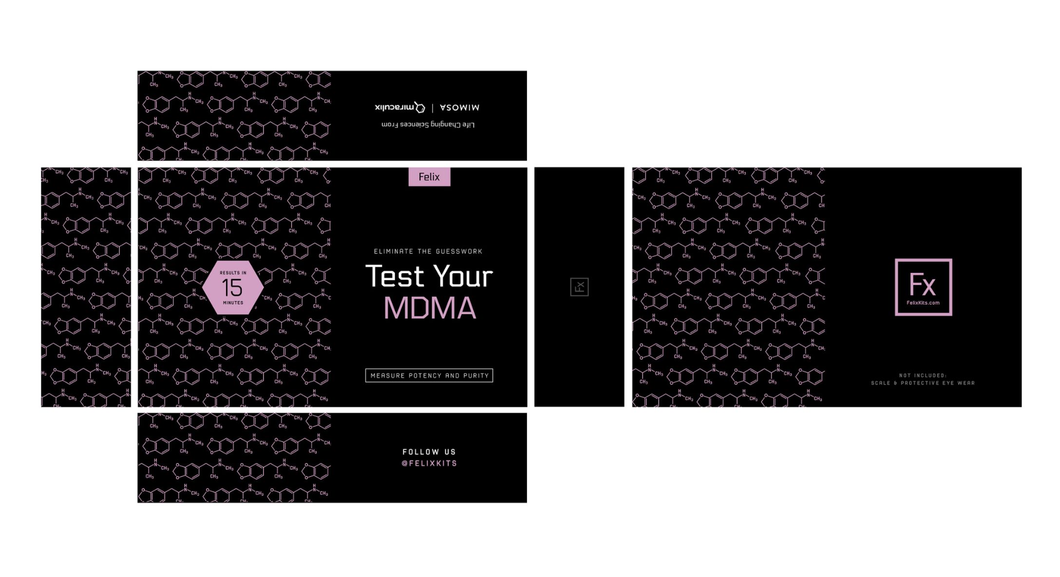
We achieved a packaging aesthetic that is sharp, slick, smart, and on point with the culture. This packaging design and copy choice also reinforces the company values. Our style was developed to stand out on shelves and look great for online sales. In addition to the design, we also sourced the boxes, and provided both local and international supply options. 
Unfortunately, the company who hired us to develop this identity was way ahead of its time in regards to the laws and regulations in place preventing its public appearance in the United States. 
While this product remains available in Europe under a different name, as of now, Felix can not officially come out on shelves in the manner it was designed and developed for. 
We hope to see the stigma towards sacraments change worldwide, and we intend to be at the forefront of making design choices that benefit their appearance.