Details
Clients
Location
Involvement

Mimosa came to me with an incredible breakthrough offering that would revolutionize the psychedelic industry.

To get a clear picture of the road ahead, I was tasked with important market research and in this research, I uncovered a huge challenge they would have to face. 

The vast majority of locals living in the region where this offering was permitted to sell had a negative stigma against the category of product.

While the Netherlands is well known for being the first country in the world to legalize psychedelics, it turned out that less than 5% of the local population were choosing to purchase these psychedelic offerings in Smart Shops. The vast majority of sales in Smart Shops were coming from tourists. 

Given this knowledge, I was tasked with the challenge of developing a brand that would reverse the negative stigma associated with psychedelics, and effectively convert non-believers into believers. We needed to educate the local population about the benefits of microdosing and introduce a new positive perspective on their healing potential.

Choosing a brand name required a deep dive into the who, what, where, when, and most importantly the WHY of the brand. We settled on “nycer” an identity that implied an improvement in quality of life for all who partake. We fell in love with the domain extension “www.nycer.world” and used that name to further introduce the implied impact of the product offering. Who wouldn’t want their world to be, even just a little bit, nycer?

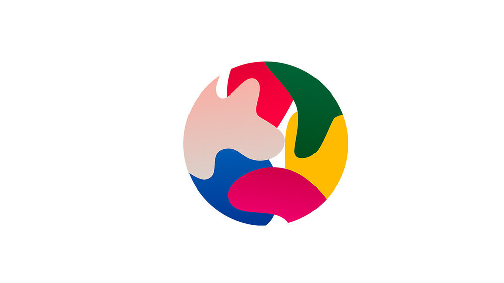
Bold and easily identifiable. Classy and clean. Friendly and modern. The nycer logo is a delicate balance between fun and sophisticated. It lives at an intersection of playful, avant-garde, kind, and inviting. It is the perfect introduction to a breakthrough line of psilocybin based microdose offerings targeted at a sophisticated mainstream audience who could be easily turned off by overly psychedelic branding. 

The active ingredient in nycer responsible for all of it’s magic and healing effect is psilocybin. Our team turned microscopic images of psilocybin into graphical elements that would be easily identifiable as a brand mark, and could be used throughout the entire brand experience. The colors we introduced created a contemporary look and feel in support of the playful nature of the brand. 
The scientific research responsible for the decriminalization and legalization of psilocybin proved that it was better than any pharmaceutical on the market for helping people overcome treatment resistant depression and trauma. Ongoing research continually discovers the addition of a wide variety of life improvements that can result in the consumption of the nycer offering. 
 
In essence, we saw this offering as holding the ability to open up a whole new WORLD of opportunities to the consumer. The graphical elements come together to create a beautiful brand mark that represents a world of color and opportunity available to anyone interested in biohacking and personal development. 
 
The idea behind the website extension www.nycer.world, is greatly reinforced by this brand mark and the suggestion of the whole new world of color its consumption will bring.
The majority of other psychedelic brands on the market appeared overly trippy or stuck in the past. It was my objective to differentiate our offering from others by creating an identity that was both clean and minimal, while simultaneously playful and attention grabbing. 
 
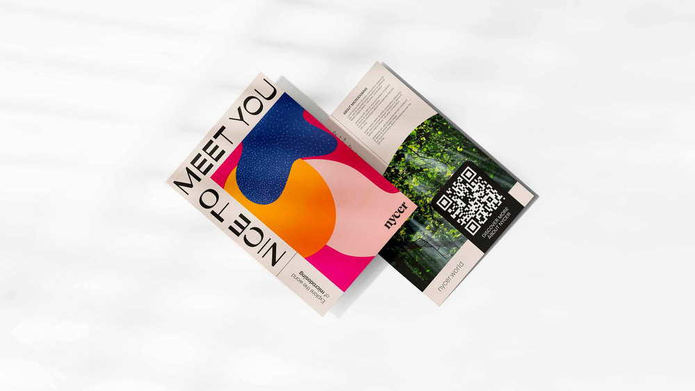
This is a box that pops off the shelf. It looks like it could hold a gift from a contemporary art museum. Due to the nature of the offering inside, we also had to do a lot of work around discovering the legal requirements behind the labels and all of the copywriting. 
Our hypothesis was that when the mainstream market would see the image above, they wouldn’t immediately think about psychedelics, and that was the point. We created this image for our first press release and we hoped that it would do a good job of introducing our brand as lifestyle brand versus being overtly psychedelic. We shared more than graphical elements. We introduced a product, packaging, a mindset, a contemporary setting, a lifestyle, and most importantly we provide inspiration to learn more.