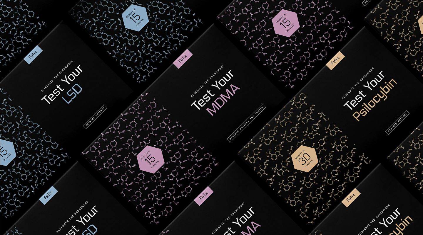
The scientific research responsible for the decriminalization and legalization of psilocybin proved that it was better than any pharmaceutical on the market for helping people overcome treatment resistant depression and trauma. Ongoing research continually discovers the addition of a wide variety of life improvements that can result in the consumption of the nycer offering.
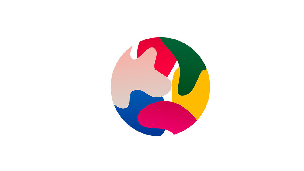
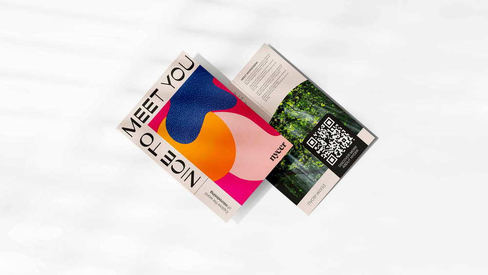
In essence, we saw this offering as holding the ability to open up a whole new WORLD of opportunities to the consumer. The graphical elements come together to create a beautiful brand mark that represents a world of color and opportunity available to anyone interested in biohacking and personal development.
The idea behind the website extension www.nycer.world, is greatly reinforced by this brand mark and the suggestion of the whole new world of color its consumption will bring.